Creative abandonment – how to reconcile the past?
Looking back through the images to find the beginning. I think it all started on the big train trip to Amsterdam/Berlin/Cologne in the summer between 2nd year and 3rd year (2013). When I started to take photographs that were less about recording distinct things and more about noticing arrangements and the intersection of textures, angles and light. For the next year these pictures felt like swatches or sketches – reference points for other work, snippets of things I wished to remember or use in something else.
But there were always a few images that stood out for me, that were complete and perfect in and of themselves. These were the ones that I felt worked as compositions, as works of art that I created. But I never showed them like that. They stayed in my camera, on my computer, printed out in my research but never on their own.
The spectrum of practice – a visual metaphor for understanding and engaging with your creative practice

What if we were to think of a creative/artistic practice as a spectrum. Not a linear, binary spectrum from one point to another, but a sphere of activity radiating from a central point, you the human at the centre of your practice.
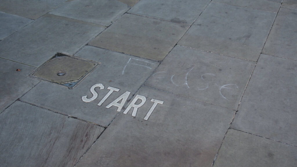
City fragments
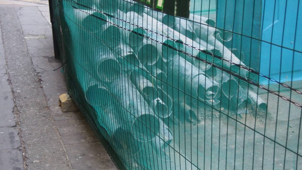
A note on building sites:
They are hives of activity, and I love to watch people work. It is a site of simultaneous creation and destruction, both of which fascinate me. There are usually a number of holes in the ground, controlled glimpses into what is buried underneath. Usually it is just the tarmac topping and the crumbly rubbly filling beneath, a kind of millionaires shortbread, but often there are wires or pipes. Scaffolding and hoardings, accompanying structures with their own short-lived beauty. These are not designed structures, no plans or cad models exist for these; they respond entirely to what is within, and adapt to the changes that take place. I like the sense that these poles and planks have been unpacked and constructed over and over, how many places, how many more? This building site uses yellow for its kit, but I have seen soft peaches, or reds, vivid greens and lilac smudges.